Editor interface
Toolbar, panels, canvas, Properties inspector, preview, code output, translations, and keyboard behavior.
Learn the PageDesigner toolbar, panels, canvas, Properties inspector, preview, code output, translations, and keyboard behavior.
The editor is divided into a top toolbar, a left tool rail and panel, the central workspace, and the right Properties inspector.
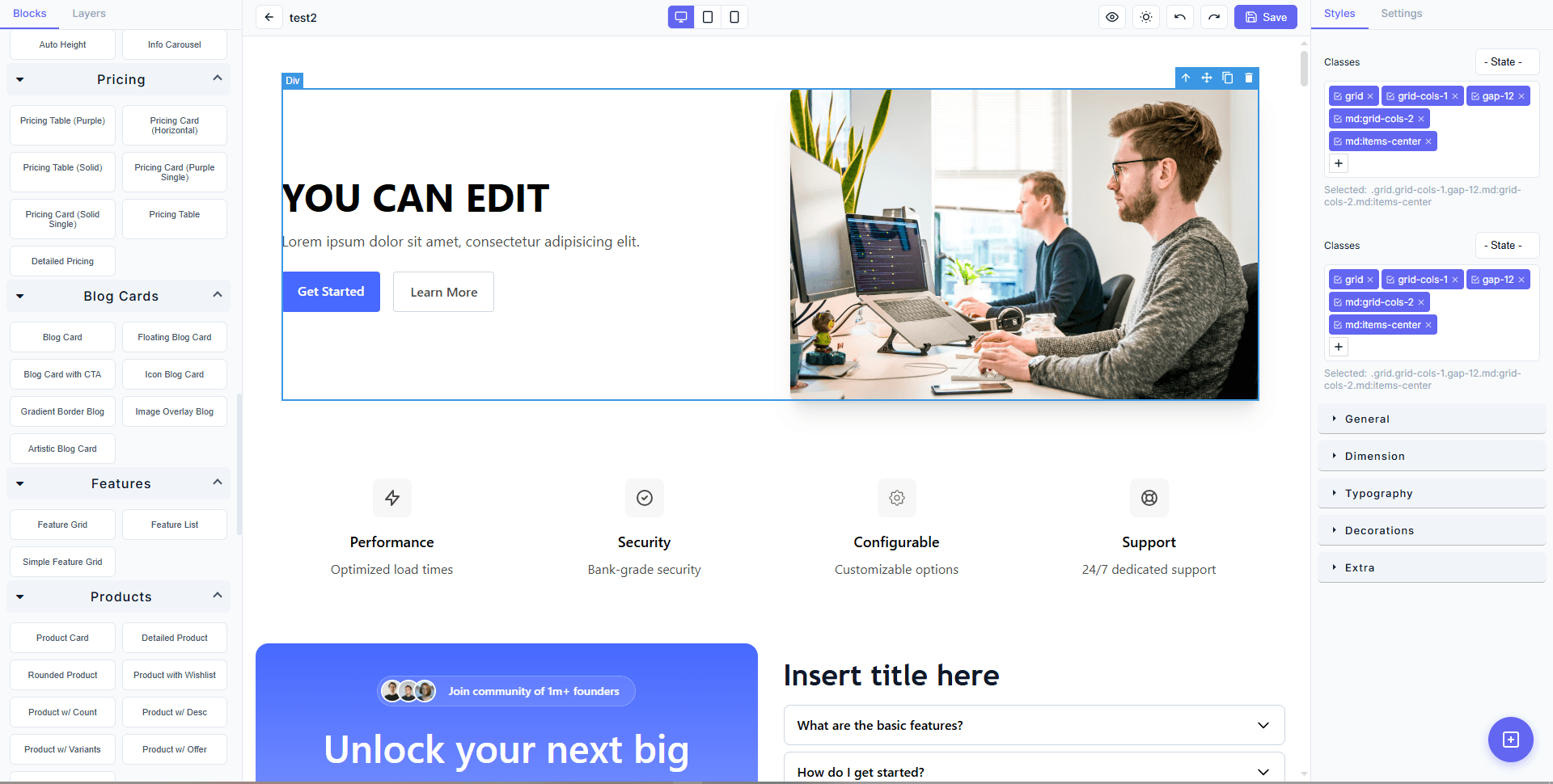
Image placeholder — numbered current interface
Replace the image above with a current high-resolution screenshot. Number the top toolbar, left rail, active left panel, canvas, Properties panel, save/share floating actions, and save status. Use a draft with generic content.
Editor map
| Area | Purpose |
|---|---|
| Top toolbar | Exit, undo/redo, interactive canvas mode, translation viewer, device widths, sharing, Properties visibility, editor theme, code output, full Preview, refresh, and save |
| Left rail | Switch between Blocks, Layers, AI Agent, and Code Output |
| Left panel | Search the component library, navigate the page tree, or talk to the AI agent |
| Canvas | Select, arrange, resize, and review page components |
| Properties | Edit the selected component's Styles, Settings, and text |
| Lower-right buttons | Share the selected component or save it as a reusable block |
Top toolbar
Exit editor
The exit control warns that unsaved work may be lost. Save first and wait for Saved.
Undo and redo
Undo reverses the latest editor-session change. Redo restores a change you just undid. They are useful for immediate mistakes, not a substitute for backups or a deliberate revision workflow.
Read-only interactive canvas
The pointer control temporarily makes the canvas behave like the visitor page. Use it to test accordions, tabs, carousels, price switches, buttons, and other interactive parts without accidentally selecting or dragging them.
Select it again to return to editing. This mode is not the final storefront Preview.
Translation viewer
The globe and locale list applies stored page translations to the editor canvas for review. It does not change the Paymenter site locale and does not alter what a visitor sees by itself.
Device width controls
- Desktop uses a wide canvas.
- Tablet uses a medium canvas.
- Mobile uses a narrow canvas.
They are three views of one responsive page, not separate page designs.
Share Page
This saves the current page and creates a share package through the hosted service. The quick editor action is appropriate for an unlisted handoff. Use the page record's Share Page action when you need explicit visibility and version controls.
Properties
The sliders control shows or hides the right inspector. Hide it when you need canvas room; show it before editing a selection.
Toggle Theme
The sun control changes the editor's light/dark appearance. It helps you review theme-aware components. It does not force the visitor's site theme.
Code Output
The <> control opens formatted HTML, CSS, and split views. You can refresh from the canvas and copy the current view.
This is a read/copy workspace. Make normal visible changes on the canvas. Page-level executable code belongs in the page record's Custom Code tab.
Preview
Preview saves the canvas, then loads the storefront route in an embedded visitor view. Use Back to builder to return. The Preview reload control refreshes the visitor view without another save.
Refresh
The circular-arrow control saves safely and reloads the editor. Use it after a long session or when the editor needs a clean restart.
Save and save status
The save icon persists the GrapesJS project, rendered HTML, rendered CSS, and page translations. The nearby status reports Ready, Saving, Saved, or Failed.
If saving fails, do not close the tab. Copy any essential text, check the browser network response and application log, then retry after the underlying issue is fixed.
Left rail and panels
Blocks
Blocks contains all components already available to the editor:
- built-in models;
- downloaded Hosted models;
- saved components;
- custom uploaded components;
- shared components;
- locally cached AI-created components.
Use the search field to filter the current sidebar library. Select the plus action to open the full Model Marketplace.
Layers
Layers is the structural tree of the page.
- Search by layer name.
- Expand all when you need the full hierarchy.
- Collapse all before focusing on one section.
- Select a layer to select the same component on the canvas.
Layers is the safest way to select a button inside a card inside a larger section, or an element covered by another layer.
AI Agent
The sparkle panel contains the durable PageDesigner design assistant, its access mode, attachments, @ component mentions, prompts, status, questions, confirmations, and Canvas changes history.
Read AI design agent before allowing page changes.
Code Output
The rail's <> action opens the same formatted output workspace as the top toolbar.
Canvas selection
Click once to select. The outline and inspector selection name tell you what is selected.
When selection is difficult:
- Exit interactive read-only mode.
- Click a clear part of the desired element.
- Select the outer component first, then the child.
- Open Layers and choose the exact node.
- Use a Settings helper such as Image or Edit Parent Link when shown.
Do not delete a parent section merely to reach a nested child.
Properties inspector
Styles
Styles controls visual properties such as:
- display and positioning;
- dimensions and constraints;
- margin, padding, and gap;
- typography and alignment;
- background and text colors;
- borders, radius, and shadows;
- light and dark theme values.
Make one class of change at a time and review mobile after layout changes.
Settings
Settings depends on the selection:
| Selection | Common settings |
|---|---|
| Link or button | Link URL, same window/new tab, title or tooltip, relationship |
| Image | Image URL, alt text, title, parent link helper |
| Video | Video/embed URL, controls, autoplay, loop |
| Theme-aware component | Light/dark background, text, and border tokens |
Text
When available, Text opens a larger modal containing every editable text node in the selected section plus a live preview. This is more reliable than selecting several tiny text nodes on the canvas.
The same modal can enable translation bindings and switch locale values.
Floating component actions
Share Component
Shares the exact selected component and returns a link or UID that another licensed PageDesigner installation can import.
Save as Block
Stores the selected component in the local reusable library. The confirmed shortcut is Ctrl + Shift + S.
Both actions require a selection. Select the complete reusable unit rather than only its heading.
Useful keyboard behavior
| Context | Key | Result |
|---|---|---|
| Selected component | Ctrl + Shift + S | Open Save as Block |
| AI composer | Enter | Send the request |
| AI composer | Shift + Enter | Insert a new line |
| AI mention menu | Arrow keys | Move through matches |
| AI mention menu | Enter or Tab | Choose a match |
| Open modal/menu/code output | Escape | Close the active layer or return to Builder where applicable |
The editor framework may expose additional browser/platform shortcuts, but only depend on shortcuts shown by the current UI. Use the visible controls when a shortcut conflicts with the browser or operating system.
Recommended working rhythm
- Make one coherent change.
- Check the canvas.
- Check mobile.
- Save.
- Use full Preview after a related group of changes.
Short loops make selection mistakes, layout regressions, and broken links easier to isolate.